Large Data with SGPR#
Making predictions with Gaussian Processes is \(O(N^3)\), which can be prohibitive for large \(N\). In this chapter we introduce the Sparse Gaussian Process Regression (SGPR), which tries to solve this problem. The SGPR tries to approximate the \(N\) actual data points with \(M\) “inducing variables”. With inducing variables the SGPR can make predicitions in \(O(NM^2)\), which can make a big difference if \(M << N\).
Note: For large datasets the “SVGP” model may also be relevant. See our section on Classification and other data distributions.
As usual we will start with our imports:
[1]:
import matplotlib.pyplot as plt
import numpy as np
import tensorflow as tf
import tensorflow_probability as tfp

import gpflow
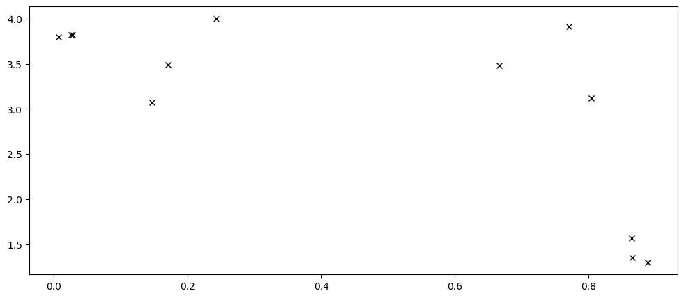
Although the sparse models are meant for large datasets, smaller datasets can be easier to understand, so we will reuse the same data we used in our Basic Usage chapter:
[2]:
X = np.array(
    [
        [0.865], [0.666], [0.804], [0.771], [0.147], [0.866], [0.007], [0.026],
        [0.171], [0.889], [0.243], [0.028],
    ]
)
Y = np.array(
    [
        [1.57], [3.48], [3.12], [3.91], [3.07], [1.35], [3.80], [3.82], [3.49],
        [1.30], [4.00], [3.82],
    ]
)

plt.plot(X, Y, "kx")
And a helper function for training and plotting our models:
[3]:
def plot_model(model: gpflow.models.GPModel) -> None:
    X, Y = model.data
    opt = gpflow.optimizers.Scipy()
    opt.minimize(model.training_loss, model.trainable_variables)
    gpflow.utilities.print_summary(model, "notebook")

    Xplot = np.linspace(0.0, 1.0, 200)[:, None]

    y_mean, y_var = model.predict_y(Xplot, full_cov=False)
    y_lower = y_mean - 1.96 * np.sqrt(y_var)
    y_upper = y_mean + 1.96 * np.sqrt(y_var)

    _, ax = plt.subplots(nrows=1, ncols=1)
    ax.plot(X, Y, "kx", mew=2)
    (mean_line,) = ax.plot(Xplot, y_mean, "-")
    color = mean_line.get_color()
    ax.plot(Xplot, y_lower, lw=0.1, color=color)
    ax.plot(Xplot, y_upper, lw=0.1, color=color)
    ax.fill_between(
        Xplot[:, 0], y_lower[:, 0], y_upper[:, 0], color=color, alpha=0.1
    )

    # Also plot the inducing variables if possible:
    iv = getattr(model, "inducing_variable", None)
    if iv is not None:
        ax.scatter(iv.Z, np.zeros_like(iv.Z), marker="^")
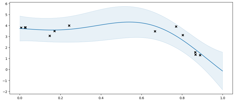
As a reference, let us try fitting our usual GPR. Notice that this works because our dataset here still is of a quite managable size. In practice you should only use an SGPR when your dataset is too large for a GPR:
[4]:
model = gpflow.models.GPR(
    (X, Y),
    kernel=gpflow.kernels.SquaredExponential(),
)
plot_model(model)
| name | class | transform | prior | trainable | shape | dtype | value |
|---|---|---|---|---|---|---|---|
| GPR.kernel.variance | Parameter | Softplus | True | () | float64 | 11.6466 | |
| GPR.kernel.lengthscales | Parameter | Softplus | True | () | float64 | 0.373332 | |
| GPR.likelihood.variance | Parameter | Softplus + Shift | True | () | float64 | 0.240012 |
Let us try fitting an SGPR. As mentioned above the SGPR is based on “inducing points” / “inducing variables”. The SGPR gains a speed-up by only capturing the shape of \(f\) at a small(ish) number of inducing points. We need tell the model where to put these. In this example we will use four inducing points, initially spaced evenly:
[5]:
inducing_points = np.array([[0.125], [0.375], [0.625], [0.875]])
model = gpflow.models.SGPR(
    (X, Y),
    kernel=gpflow.kernels.SquaredExponential(),
    inducing_variable=inducing_points,
)
plot_model(model)
| name | class | transform | prior | trainable | shape | dtype | value |
|---|---|---|---|---|---|---|---|
| SGPR.kernel.variance | Parameter | Softplus | True | () | float64 | 11.79179 | |
| SGPR.kernel.lengthscales | Parameter | Softplus | True | () | float64 | 0.38664607378177496 | |
| SGPR.likelihood.variance | Parameter | Softplus + Shift | True | () | float64 | 0.24753007081514652 | |
| SGPR.inducing_variable.Z | Parameter | Identity | True | (4, 1) | float64 | [[0.21006069... |
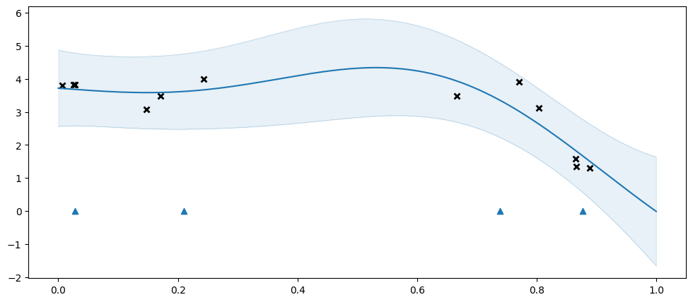
Here we get an excellent fit, even though the original data has 12 points, and we are approximating it with only four inducing points.
The blue triangles represent the positions of the inducing points.
You may notice that even though we initialised our inducing variables to be evenly spaced, they are spaced irregularly when plotting the model. The inducing variables are represent by a GPflow Parameter, and is optimised during model training, along with the other parameters.
For illustrative purposes, let us see what happens if we don’t use enough inducing points:
[6]:
inducing_points = np.array([[0.25], [0.75]])
model = gpflow.models.SGPR(
    (X, Y),
    kernel=gpflow.kernels.SquaredExponential(),
    inducing_variable=inducing_points,
)
plot_model(model)
| name | class | transform | prior | trainable | shape | dtype | value |
|---|---|---|---|---|---|---|---|
| SGPR.kernel.variance | Parameter | Softplus | True | () | float64 | 6.99571 | |
| SGPR.kernel.lengthscales | Parameter | Softplus | True | () | float64 | 1.09965 | |
| SGPR.likelihood.variance | Parameter | Softplus + Shift | True | () | float64 | 0.5799875691970902 | |
| SGPR.inducing_variable.Z | Parameter | Identity | True | (2, 1) | float64 | [[0.12846436] [0.82829222]] |
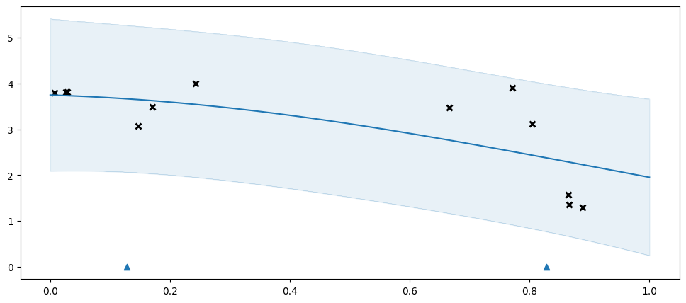
The two inducing points above are not enough to capture the data well, so we get an overly simplistic \(f\), and the model compensates with an overly high variance.
Picking initial inducing points#
When you use a sparse model you will need to pick initial inducing points, and choosing these correctly can have a large impact on performance. Above we used a simple grid. This often works well when your data is 1D, but we do not recommend using a grid for higher-dimensional data. In this section we discuss some alternatives.
First, let us declare some 2D data:
[7]:
X = np.array(
    [
        [0.70, 0.70], [0.53, 0.81], [0.78, 0.36], [0.83, 0.09], [0.71, 0.55],
        [0.66, 0.75], [0.87, 0.50], [0.63, 0.65], [0.37, 0.90], [0.82, 0.11],
        [0.58, 0.61], [0.93, 0.21], [0.98, 0.18], [0.85, 0.27], [0.64, 0.77],
        [0.49, 0.73], [0.13, 0.82], [0.93, 0.08], [0.65, 0.71], [0.54, 0.83],
        [0.85, 0.20], [0.90, 0.07], [0.00, 0.84], [0.64, 0.81], [0.62, 0.70],
    ]
)
Y = np.array(
    [
        [0.83], [0.82], [0.60], [0.31], [0.73], [0.85], [0.70], [0.77], [0.77],
        [0.34], [0.73], [0.45], [0.39], [0.51], [0.85], [0.76], [0.46], [0.27],
        [0.82], [0.85], [0.44], [0.26], [0.28], [0.87], [0.81],
    ]
)
And write a helper-function to plot a model:
[8]:
def plot_2d_model(model: gpflow.models.GPModel) -> None:
    n_grid = 50
    _, (ax_mean, ax_std) = plt.subplots(nrows=1, ncols=2, figsize=(11, 5))
    Xplots = np.linspace(0.0, 1.0, n_grid)
    Xplot1, Xplot2 = np.meshgrid(Xplots, Xplots)
    Xplot = np.stack([Xplot1, Xplot2], axis=-1)
    Xplot = Xplot.reshape([n_grid ** 2, 2])

    iv = getattr(model, "inducing_variable", None)
    # Do not optimize inducing variables, so that we can better see the impact their choice has. When solving
    # a real problem you should generally optimise your inducing points.
    if iv is not None:
        gpflow.set_trainable(iv, False)
    opt = gpflow.optimizers.Scipy()
    opt.minimize(model.training_loss, model.trainable_variables)

    y_mean, y_var = model.predict_y(Xplot)
    y_mean = y_mean.numpy()
    y_std = tf.sqrt(y_var).numpy()

    ax_mean.pcolor(Xplot1, Xplot2, y_mean.reshape(Xplot1.shape))
    ax_std.pcolor(Xplot1, Xplot2, y_std.reshape(Xplot1.shape))
    ax_mean.scatter(X[:, 0], X[:, 1], s=50, c="black")
    ax_std.scatter(X[:, 0], X[:, 1], s=50, c="black")

    # Also plot the inducing variables if possible:
    if iv is not None:
        ax_mean.scatter(iv.Z[:, 0], iv.Z[:, 1], marker="x", color="red")
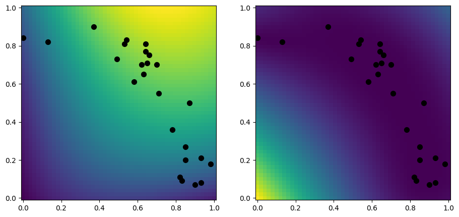
Let us first make a plot of a dense model, for comparison:
[9]:
model = gpflow.models.GPR(
    (X, Y),
    kernel=gpflow.kernels.RBF(),
)
plot_2d_model(model)
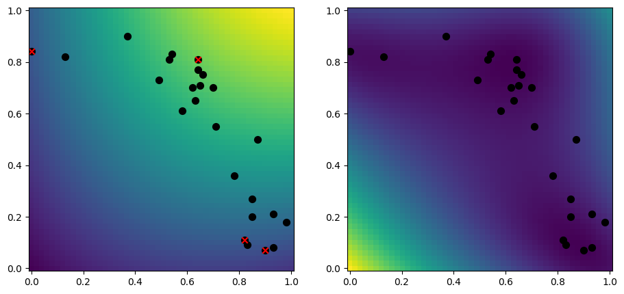
Random data samples#
A simple approach to selecting inducing points, is to randomly select a subset of your data:
[10]:
rng = np.random.default_rng(1234)
n_inducing = 4
inducing_variable = rng.choice(X, size=n_inducing, replace=False)

model = gpflow.models.SGPR(
    (X, Y),
    kernel=gpflow.kernels.RBF(),
    inducing_variable=inducing_variable,
)
plot_2d_model(model)
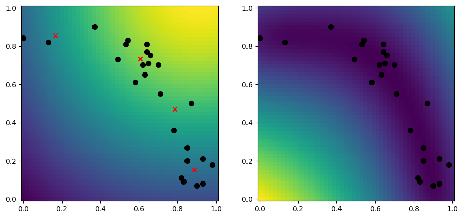
k-means#
Another good approach is to use the k-means algoritm, which tries to find \(k\) centers of your data:
[11]:
from scipy.cluster.vq import kmeans

n_inducing = 4
inducing_variable, _ = kmeans(X, n_inducing)

model = gpflow.models.SGPR(
    (X, Y),
    kernel=gpflow.kernels.RBF(),
    inducing_variable=inducing_variable,
)
plot_2d_model(model)
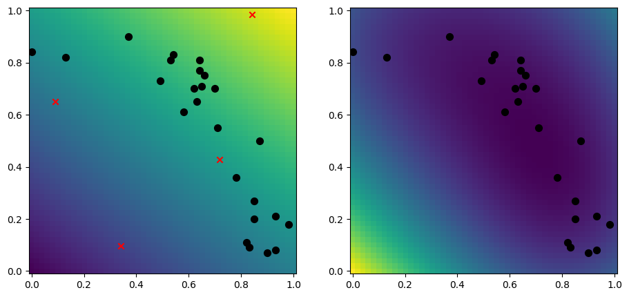
Uncorrelated samples#
It is a good idea to pick inducing points that are close to your data, which the above two algoritms does well. However they can struggle with some corner cases, such as if you do not (yet) have access to your data, or if you need to pick more inducing points than you have data. An approach that does not select points close to your data, but that can be more robust in some circumstances, is to use a low-discrepancy sequence:
[12]:
n_dim = X.shape[-1]
n_inducing = 4
inducing_variable = tfp.mcmc.sample_halton_sequence(
    n_dim, n_inducing, seed=1234
)

model = gpflow.models.SGPR(
    (X, Y),
    kernel=gpflow.kernels.RBF(),
    inducing_variable=inducing_variable,
)
plot_2d_model(model)
Advanced initialisation#
If none of the above approaches work well for you, we recommend that advanced users to look at the RobustGP repository.